This website uses cookies and is meant for marketing purposes only.

Imagine you’re flying in a helicopter over a herd of stampeding buffalo. A hundred metres directly ahead of the herd is a small flock of sheep, but a rock formation separates them from the galloping beasts. Are the buffalo likely to divert their course upon reaching the rocks, missing the flock completely, or will they skip over the rocks and continue on their lethal path?
There is no way of knowing for sure. Several factors are all at work simultaneously in determining the outcome: the animals’ moods, their level of thirst or hunger, the distance they’ve already run, the weather, and so on. The opaqueness of their decision-making processes also makes it impossible to say beforehand what they’ll do in a given situation.
However, let’s say you’ve flown over the same herd every day for the past three months and carefully documented their reactions to hundreds of different situations. According to your data, the buffalo tend to shy away from obstructions like rocks 70% of the time when rushing at full speed. This means that, although today’s outcome does remain an unknown, there is a substantial probability the sheep will survive.
Financial traders do not, in most respects, resemble a herd of buffalo. They are often quite charming, and they usually smell a lot better. But, in a certain sense, they are comparable. Each trader views himself as one participant among many others, each of whom exerts some influence on the overall trend, on the one hand, but must, on the other, conform to the collective will in order to succeed. A particular buffalo might want to stop for a drink, but, if the herd wants to keep on going, he’ll have to do the same. You might want prices to go up but, if you know what’s good for you, you’ll adapt to the situation when they start dropping.
This description fits every one of the traders who make up the market you’re trading in. The question we now want to ask is: How are people, when placed in such a situation, likely to behave? When they, for instance, see the market pushing prices up to exaggerated levels, as during the dotcom bubble of 1999, how will they react? Will they all jump ship and sell? Will each one elect to stay on for fear of losing out? Or will the result be something in between? Candlestick patterns offer us a workable level of probability in answering questions like these. And this could be very valuable to you. The more you become a master of trader behaviour, the more you’re likely to perceive what’s just around the corner for prices, which is precisely what you need in order to succeed. Candlestick patterns are the specialized tools made to help you gain this expertise.
Candlestick chart patterns are, essentially, illustrations of the data recording traders’ behaviour over the course of one minute, one hour, or one day. The trader who is an expert in candlestick chart patterns has a considerable advantage over others: namely, that he has specialized knowledge of what traders tend to do to prices in various situations. Each candlestick pattern hints at the likely group reaction in a given circumstance.
By way of further explanation, let’s dive directly into three important types of candlesticks and their meanings.
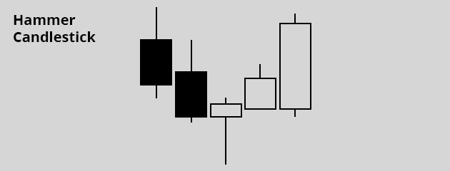
The bullish hammer pattern shows that traders, who were overwhelmingly driving prices downwards, seem to be positioning to change around to a positive trajectory. If it referred to buffalo, it would mean that, most of the time, when the herd displayed this sort of hesitant behaviour after speeding down a hill, they followed by turning around and running up in the opposite direction. The benefit we seek from the hammer is to identify an entry point for a “buy” trade, from where we might expect prices to climb.

The black colour of the first two candles signifies closing prices were lower than opening prices for those two sessions. The tops of these candles (called the “real bodies”) show the points where prices started out, and the bases indicate where they ended up. This means that, overall, the bears got the better of the bulls in those sessions. The “wicks” above and below the candles (called shadows) indicate the highest and lowest prices touched upon in the sessions, respectively.
As you see, things started to change in the course of the third session. Namely, the downward momentum of the previous two sessions came to an end. Instead of another long black candle, we have a short white one (which forms the head of the hammer) with a long shadow extending downwards underneath (the handle). The white colour indicates prices ended higher than they opened, so prices opened at the base of the short real body and closed at the top. (Some charts will use green and red instead of white and black). The long shadow, which should be at least double the size of the real body, records the fact that the bears tried to continue their downward pressure on the third day but met with resistance from the bulls, who pushed prices back up.
Now, focus in on the fourth candle in the sequence, which is a longer white one. At the moment trading closes for that fourth session, (indicated by the top of the real body), we see prices have been pushed even higher than they were in session number three. This is called confirmation: It confirms the bulls indeed overpowered the bears and initiated positive momentum of their own. The buffalo have started galloping up the hill again. There’s no guarantee they’ll continue, but, if historical behaviour is anything to go by, it’s likely they will. Therefore, a trader may choose to open a “buy” deal right at this point in expectation that session number five will look like the fifth candle in our picture: long and white. If it does, his deal will be a success.
A couple of details about the hammer: Firstly, traders usually look for extra confirmation from some other technical indicator before acting on this signal. And, secondly, the hammer gives you no indication of where to place your take profits order. To identify this point, you’ll have to search for a notable resistance level, where rising prices tend to stall.
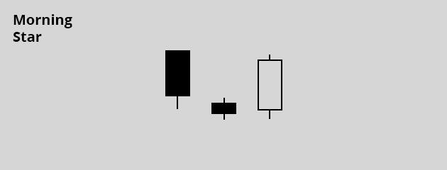
The morning star, like the hammer, is a signal for a bullish reversal. The first candle in the three-candle sequence is a long black one, indicating the relative strength of the bears in that session. The short middle candle can be either black or white, meaning that it’s immaterial whether prices gained overall for that period or not. The point is that the bears are starting to doubt themselves in session number two: “Perhaps” they start to worry, “we’ll be unable to drive prices much lower than this.”

When the third candle turns out nice and tall and white, as in the picture, we have a complete morning star. It’s confirmed that the bears have given way to the forces of bullishness, and we have reason to expect more of the same. In fact, the data show that this is quite a reliable indicator of a bullish uptrend, and it’s also relatively easy to spot on your price charts.
The time to open your buy deal would normally be when the third candle is almost fully formed. Traders tend to hesitate, though, and first check if trading volume is building up over the three sessions. If day number three records the highest volume of all, this is considered sufficient confirmation to act on the bullish signal. In the absence of a volume indicator, traders will look to see if prices have reached a level of support, where they have tended to stop dropping in the past. If they have, this will also act as confirmation. A third option would be if we had reason to believe the asset was oversold, which we could get from the RSI (relative strength indicator).
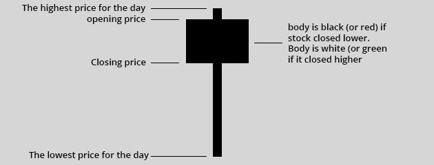
It doesn’t matter whether the Hanging Man is black or white: the sight of him always dampens the mood! Indeed, whether or not prices closed higher than they opened for this session doesn’t matter to us. Either way, this pattern indicates prices are likely to fall. Traders were indeed optimistic in the preceding sessions, driving prices higher and higher. But this bearish reversal pattern indicates they’re starting to wonder how high prices can really go, and that they might be readying to change course. The confirmation for such a signal, as you might expect, is a trading session that drags prices further down, represented by a black candle.

When searching for a Hanging Man, look for a lower shadow that’s two or three times the length of the real body. Some traders believe in the signal with more conviction if it displays an especially long shadow. And the reason for this is clear: the shadow reflects how far the bears managed to reverse the uptrend in the course of that session. The bulls did manage, before the end, to restore prices closer to where they started, but we believe this could be the beginning of the end for them. They’re losing their conviction. Some technical analysts put the chances of a bearish continuation after the Hanging Man at about 70%. In other words, the stampeding buffalo are probably slowing down in order to turn around and retreat, rather than to catch their breaths and continue on.
For a trader to be really confident a bearish reversal is happening, he’d like to see a rush in trading volume during the day of the Hanging Man. In the course of the following day, when prices are getting pushed lower (and a black candlestick is forming), he would open a “sell” deal on the asset. If prices keep on dropping after this, he’ll be cheered by the earnings accruing from his deal after that initial shock at seeing the dreaded Hanging Man.
In CFD trading, it doesn’t matter whether the prices of your asset or index are climbing up or falling down. Simply open a “buy” deal when you believe prices are on the up, and a “sell” deal when you think the good times are over. Therefore, the sight of the Hanging Man need not depress you at all, and you might even start making friends with him.
In summary, what candlestick chart patterns can offer you is a way to understand the ebbs and flows of market activity. Specifically, they teach you how these movements represent human beings’ emotional reactions when involved in financial trading. When we learn about the various types of candlesticks, we are really growing familiar with patterns of trader behaviour that tend to prove themselves over time.
Diligent learning and practice are required before you’ll be able to confidently identify candlestick patterns for yourself and act on them. Once you put in the effort, however, there’s no reason you can’t be become a master of herd behaviour in your own right and trot ahead with your head held high.
The materials contained on this document should not in any way be construed, either explicitly or implicitly, directly or indirectly, as investment advice, recommendation or suggestion of an investment strategy with respect to a financial instrument, in any manner whatsoever. Any indication of past performance or simulated past performance included in this document is not a reliable indicator of future results. For the full disclaimer click here.
Join iFOREX to get an education package and start taking advantage of market opportunities.