This website uses cookies and is meant for marketing purposes only.

What financial traders would love to know is what’s going to happen to an asset’s price at a given time in the future. If they knew, for instance, that the prices of Ford shares are destined to rise by 5% in 24 hours’ time, they would open large buy deals on those shares today and then, tomorrow, rake in enormous earnings. The trouble is that, until somebody invents a time machine, it will remain impossible to know the future price action of any asset. And the reason is clear: What drives prices up or down is the buying and selling behavior of human beings, which eludes formulaic types of explanations. News items, psychological pressures, and unexpected events are parts of life. Any combination of these or other factors could come to the fore to drive buying or selling pressure, in such a way that no one could have seen it coming.
If so, what do financial traders have to gain by studying trading chart patterns that represent historical price activity? The answer is that they are like students of psychology, eager for an insight into traders’ instincts. Behind the stock market patterns on their computer screens is a record of how people adjusted their buying and selling activities in similar circumstances to the present one. With proper analysis, it’s possible to determine what sort of trading behavior developed from situations like the present one on past occasions. If so, and if you accept that people are likely to act in the future as they have done in the past, we may have a way of gauging what the next price movement will be.
Similarly: You may not know how the population of Paris would react to a further extension of the national age for retirement, but knowing how they reacted to the original extension could probably provide a helpful clue.
Trading chart patterns and technical analysis were not made exclusively for mathematical geniuses. These useful tools are actually accessible to most of us. All that’s needed is to demystify some of those exotic-sounding terms and intimidating graphs with some straightforward explanation. It’s worth your while to give it a try because academic research confirms the predictive power of trading patterns.
In this article, we’ll start the process by discussing five chart patterns that rank among the most useful for online traders. Their (not so intimidating) names are:
1. Ascending Triangle
2. Descending Triangle
3. Bullish Flag
4. Bearish Flag
5. Pennant
On a graph showing the price activity of an instrument over a certain period, it’s possible to draw various kinds of lines. For instance, you could draw a trendline connecting the highest prices reached during each trading session, or you could draw one that follows the lowest prices. Most commonly, closing prices for the sessions are used as the points from which to plot trendlines, and there are good reasons for this.
Much of the time, it’s when a clear bullish or bearish trend pauses that price patterns are looked for. It’s important to realize that trading chart patterns don’t present themselves to technical analysts’ minds unambiguously. In fact, when you look at a price chart, you may be able to identify several different trading patterns within it. Which ones are “really there”, and which ones are most relevant must be determined by technical analysts. Since these are human beings with flaws and, at the very least, different ways of viewing things, there’s room for bias and error in this practice. The more you build up your skills, however, the more likely you are to pinpoint relevant patterns.
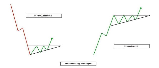
The first pattern we’re going to look at is a continuation pattern, which indicates prices will continue to head in the direction they were originally going. If the price action on your chart describes an uptrend around which you can draw a triangle with a flat, horizontal top and a rising diagonal line meeting it at the right-hand corner, you have met your first ascending triangle. The horizontal shows the point up to which prices were repeatedly driven by the bulls, but where the bears stood firm and resisted them with downward pressure, cutting off an extension of the rally. The diagonal indicates, however, that the support level, below which prices will not drop, is steadily rising. In other words, the bulls are slowly winning out over their rivals.

The signal means that, once prices break out beyond that horizontal ceiling, they are likely to keep going upward. Thus, someone who saw that prices were breaking out of the top of the triangle would often choose that precise time to open a buy deal. In the event he saw trading volume increasing as prices broke out of the triangle, he would feel affirmed in his decision because this indicates new buying energy.
This is also a continuation pattern, but, this time, the horizontal is at the base of the triangle and meets a descending diagonal to form the right-hand corner. The diagonal shows that the series of price highs is progressively getting lower, as the bulls’ power to drive prices up steadily weakens. When prices break out below that horizontal floor, traders expect the selling action to take control and drive a further downtrend. Many of them would, therefore, elect to open a sell deal just at the point where prices break beyond the horizontal. The upper trendline could be used as the place to set their stop-loss order.
You’ll find this bullish continuation pattern on stocks that are enjoying a robust uptrend. The shape of a flag on a pole indicates that bulls are not letting prices settle back down after they drive a rally. Rather, they persist in coming right back and buying up more shares before prices have time to drop down to more affordable levels. When prices break out from the flag, traders expect a fresh injection of bullish energy and take the opportunity of opening a buy deal. As trading chart patterns go, this one is regarded as quite reliable.
This flag waves to you during a bear run and signals that, once prices shoot out below the floor of the flag, a new wave of bearish sentiment is about to manifest. One noteworthy difference between this flag and the Bullish Flag is that trading volume here will tend not to drop in the middle of the flag, (the consolidation period when bearish energy is building up). This makes perfect sense because the emotion driving selling activity is invariably fear (of losing money), which tends to inspire a sense of urgency. This explains the strong trading volume recorded as the bears get the better of the bulls. By contrast, when you have a Bullish Flag before you, you’re likely to see trading volume get weaker before new buyers come in reignite the bullishness.
This pattern starts off with a large price movement that will form the pole upon which your pennant will fly. Similarly to the cases above, a consolidation period will then follow and describe the pennant shape. When prices break out in the same direction as the original movement, traders anticipate a continuation of the initial trend. It’s common for financial traders to use trading patterns like pennants together with other indicators to confirm the signal. For instance, they might check if the RSI (Relative Strength Index) settles down during the consolidation period. If it did, this would confirm their suspicions of a continuation.
Using more than one indicator is advised by many technical analysts because there’s always the possibility of being misled by a false signal. In circumstances where traders see multiple and contradictory signals on their graphs, they tend to step back from the trading action and take a coffee break. With the passing of time, as traders accumulate experience in using stock market chart patterns, they decide on the combination of signals that works best for them. In general, this means they’ll ensure there’s enough data on their charts to motivate a clear course of action, but not so much as to paralyze them into indecision.
The materials contained on this document should not in any way be construed, either explicitly or implicitly, directly or indirectly, as investment advice, recommendation or suggestion of an investment strategy with respect to a financial instrument, in any manner whatsoever. Any indication of past performance or simulated past performance included in this document is not a reliable indicator of future results. For the full disclaimer click here.
Join iFOREX to get an education package and start taking advantage of market opportunities.