In this article we’ll uncover an ancient Japanese method used to attempt to forecast future price movements: Japanese candlesticks. Don’t let the word ‘ancient’ fool you. The Japanese candlesticks might have been invented in the 1700s, but many investors believe that it’s just as relevant today as it was then.

A long time ago in Japan, before square watermelons were a thing, a rice futures trader named Homma realized something so profound it would make Godzilla stop in his tracks. He noticed that the price of rice did not necessarily increase and decrease as a direct response to the market’s supply and demand. He also realized that there was a lot of emotion involved in the process of pricing rice.
This concept is known as ‘sentiment’. He therefore concluded that a chart representing previous price trends alone wasn’t enough to understand the thought process behind the commodity’s price changes. That’s why he developed a system that shows not only daily prices, but the opening and closing price, the daily highs and the daily lows all in one easy-to-read graph. This type of financial graph chart is known as ‘Japanese Candlesticks’ (or just ‘candlesticks’).

In short, the Japanese candlesticks chart is a multi-dimensional price chart and although at first glance it appears to be showing price changes only, it can also indicate the market sentiment that stands behind the price fluctuations, a more insightful indicator than most standard bar charts.
Although candlesticks are primarily a tool for technical analysis traders, it’s the closest you’ll get to fundamental analysis inside a chart.

To understand Japanese candlesticks charts and what they represent, you must first understand each component and what they symbolize. Candlestick charting can be quite complicated and could be hard for many people to comprehend. But you’re not just anyone. You thirst for knowledge. Well, just in case you need some help with the basics, let’s get started by taking a quick look at what a Japanese candlestick pattern is, and what it can potentially reveal to you about an instrument.
The upper shadow, or ‘wick’, represents either the opening or closing price depending on the colour of the candle. If the day’s closing price is higher than the opening price, the real body, or ‘stick’, will usually be either white or transparent. If however, the closing price is lower than the opening price, the candle will usually be black.
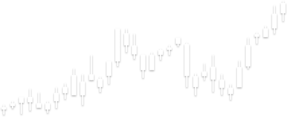
See the chart below for a more detailed explanation.


Japanese candlesticks are built to show us the opening and closing prices, as well as the daily highs and lows of a specific time-period.
The Japanese candlestick charting method is extremely popular amongst investors. One major reason is because the graphs can be seen as reflecting short-term forecasting exclusively, oftentimes with a duration of less than 8 to 10 trading sessions.
There are many candlestick patterns that interest traders. The Doji is a popular example. Dojis are created if the price of a given currency pair opens and closes at nearly identical levels inside the timespan of the chart being read. Although lots of volatility and price fluctuations could have occurred between the opening and closing price of the stick, if the open and the close price is similar, it indicates that the market is indecisive and has been unable to determine the pair’s direction (up or down).
Traders use Doji candle signals as a potential indication of a price direction. Does this mean prices will always change? Of course not, that’s why it’s just an indication.

In general, there are five different types of Doji candles. Although they look a bit funny, they can be used as an indication, potentially assisting traders to better determine where to place a stop order. The arrow in the diagram to the left points to a standard Doji candle.

On the left is an example of a Long Legged Doji. The only visual difference between it and a standard Doji is that both vertical and horizontal lines are longer. The lifecycle of the candle demonstrates that price action fluctuated upwards and downwards. However, it also closed at almost the same level as its opening price, demonstrating indecision with regards to buyers and sellers.

The image to the left is called a ‘Dragonfly’ Doji. These candles can be seen at either the tip of an uptrend or at the lowest point in a downtrend. As you can see, the lack of a line above the horizontal bar indicates that prices didn’t go above the opening price. However, an extended bottom wick indicates a negative movement, which can potentially correct itself into bullish territory.

A ‘Gravestone’ Doji is the equal and opposite nemesis of the Dragonfly Doji. This doji indicates that opening and closing prices were at the lower end of the trading trend. It also shows that following the opening, the price rose. However, after the close, the upward momentum essentially stops. This could potentially indicate a bearish signal.

The 4 price Doji just looks like a dash. It has no vertical line whatsoever. There is no better indication of indecision than when all four prices (high, low, open and close) are identical. There’s really not a whole lot to go on when you get one of these and it can hardly be used as any sort of reliable signal (sorry).
The hanging man and hammer candlestick patterns are signals that can potentially reveal a price correction. The hanging man means that the price trend is heading uphill with a bearish correction expected. A hammer pattern means that the trend is going downward and an upward correction is expected. Besides the aforementioned difference, the two patterns are similar in virtually every other aspect. Both patterns involve one candlestick whose body is close to the top of the candle, an extended lower shadow at least twice the length of the real body and virtually no upper shadow. In such cases, the candlestick’s colour is inconsequential.

Hammer Doji
When performing technical analysis using a chart like the Japanese candlesticks, the Morning Star candlestick pattern can represent a reversal pattern. This particular pattern boasts three types of Japanese candlesticks developing at the bottom of a downtrend.

Morning Star
In the chart above, you can see the morning star candlestick pattern.
When the trend starts heading ‘downhill’, it’s usually an indication of negative outlook (bearish) and comes from the massive selling volume of an asset. When that happens, a long, bearish candle develops. Lack of decision between buyers and sellers will often lead to the creation of the following candlestick, which is a Doji. When investors anticipate positive news of a given asset, it could create the third candle which is relatively long and is ‘bullish’ in nature. If the asset price increases, it can indicate a change in trend. The word to note of course is ‘can’ – keep in mind this is just theory, of course.
Simply put, a Bullish Harami candlestick is when a big candlestick is followed by a small one and its real body does not exceed the vertical range of the previous one. Although it’s called ‘bullish’, a Bullish Harami is actually a bearish or downtrend candlestick and is often used to indicate a correction of a downward trend. Because the bullish Harami implies a trend reversal, it could potentially indicate an ideal time to go long. However, there is no guarantee of success.
A Bearish Harami, on the other hand, is a trend presented by a small candlestick followed by a far bigger candlestick with a real body that fits inside the vertical range of the bigger candle's real body. This type of pattern could theoretically mean that the last bullish trend is coming to a grinding halt.

Are you getting dizzy with patterns? We get it. Don’t worry – we’re getting close to the end now. Take a deep breath and let’s get through the last stretch.

When a candlestick pattern develops during an uphill trend, it’s called a ‘Bearish Belt Hold’ candlestick pattern. After a sequence of bullish trades, a bearish or solid-coloured candlestick develops. When the opening price becomes the day’s high and is greater than yesterday’s close; the asset price drops during the trading day. This results in a long, solid-coloured candlestick with a small lower shadow while lacking an upper shadow.

A Stick Sandwich is a candlestick pattern whereby three candlesticks become what looks like a sandwich (yummy). It features the middle candlestick having a contradictory colour of the candlesticks it’s surrounded by. Each one has a bigger trading range in comparison to the middle candlestick. Stick Sandwich patterns may theoretically be used as both bearish and bullish indicators.
A ‘Stick Sandwich’ happens when a bar is ‘surrounded’ by two longer bars that are different colours than the one in the middle.
Remember: Candlestick chart analysis is theory, not fact
We hope we don’t need to tell you that using candlestick charts while trading is not some magical tool that will tell you what to do next. Past price movements are not necessarily an indication of future price movements. Many traders believe that analyzing candlestick charts can help them make trading decisions, but this is just a theory and it certainly doesn’t guarantee results.
If you feel the information in this article was helpful and you’d like to discover the exciting world of online trading using Japanese candlestick charts, the next step is to choose a reliable broker.
Although candlestick charts may appear intimidating at first glance, they are very accessible and useful tools that help you gauge the sentiment guiding the market. They are not oracles to be relied upon with absolute certainty but, rather, historically confirmed indications of future price activity. Since the future doesn't always look like the past, it's not uncommon for candlestick patterns to fall short in their job of predicting what's ahead.
With steady practice, you can integrate candlestick patterns into your trading strategy to great effect. The extent of your reliance on them, and the particular patterns you use, will ultimately be up to you. Traders agree, however, that their predictive power is enhanced by other technical indicators that confirm their signals.
Join iFOREX to get an education package and start taking advantage of market opportunities.
 A beginner's e-book
 $5,000 practice demo account
 A 12-part video course
 Trusted partner
 Featured partner